All integrated into the Discord server with the SkyJedi dicebot, D1-C3.
No problem. I look forward to this!
All integrated into the Discord server with the SkyJedi dicebot, D1-C3.
No problem. I look forward to this!
Hmm.. I don’t see that at all. This is what I see in the document:
I just refreshed the PDF upload and I see this on the PDF
Not sure why the display is off on your end. Maybe the PDF previewer is wonky in dropbox?
All integrated into the Discord server with the SkyJedi dicebot, D1-C3.
Roger that. So should we start a new thread for the playthrough or keep going here?
Edit: I created all 4 characters on SWSheets. I think I got everything on there.
Edit2:
look forward to this!
Me too! I’m usually the GM/DM so I don’t get to play very often. Should be interesting!
Oh, haha! That’s because you completely changed the layout.
Sorry!! I was sure I had updated the PDF :p
The picture issue was from a previous version, and I hadn’t yet updated to the new one. I don’t update until we’re all the way done with a set of revisions, that way I have easy access to what I was critiquing.
Alright, final run-through on the adventure, mechanics, and writing sides of things. Wasn’t much to cover there. Only thing left is to unify styles, and I gave some detailed suggestions below.
All good here.
Style:
“Farmers go at the end of the round” can be dropped in favor of describing them as “not participating in the battle other than to take cover,” but it can safely be left as well. Up to your discretion.
I think it’s fair to leave it so that they are not forgotten. Their only objective is to get to safety but who knows what will happen before their turn hits? ![]()
Page 4: “Star Wars” logo is squished, star background looks good, text should use “justify” alignment.
Sadly the photo editor I was using doesn’t support “justify” so I had to redo the whole page but I think it looks OK now. Let me know if I need to tweak the positioning or font sizes since I had to revamp it… this took longer than I’d like to admit… but at least it’s easier to modify now without breaking something.
I had capitalized Darga’s and Cargo but not “missing” so I capitalized all three words for consistency.
The columns on page 9 are out of alignment. The right is higher than the left. Check this on other pages too, I won’t necessarily catch them all.
OK. I slightly adjusted pages 2, 6, 9, 10, 11, 12, 13. This was a painful level of precision ;).
Page 10: In statblocks, there should be a period following any list (skills, equipment, etc.). This applies to all statblocks.
Ability descriptions go in parentheses, and do not use a colon. This applies to all statblocks.
Done.
As written, “attacks” is the subject of both the Threat and Despair sentences. That means that “it could” refers to “attacks.” I believe you intend the symbol to be the subject, in which case “Net Threat/Despair generated by attacks could”
Otherwise, you need to correct subject-verb agreement.
Yes… the symbol would be the cause / subject. Changed it to your suggestion.
Is this reference to “see page 2” really necessary?
I suppose not. I put it in to remind the GM that in the grand scheme of things, the true goal of the party is to befriend Darga and this adventure is just a sidequest in a much bigger operation, but we probably don’t need the reminder… at this point the GM will know where he is at in his campaign… hopefully =p
Perhaps “They are usually left alone.” (“They are able to chase them away” is an acceptable CRIP)
So no change needed here?
Colon inconsistently stylized with the rest of the header.
Translation: It shouldn’t be stylized?
Check all text-boxes to make sure the header doesn’t clip into it (it does here)
It doesn’t seem to be clipping for me; they are on separate lines in the same text box… unless I am misunderstanding what you mean…
Should it have more room to breathe even if it’s not touching? I think most of the headers are this close.
Page 18: You use the singular neutral “he” in the first paragraph, then the colloquially singular neutral “their” in the second. The early FFG books used the singular neutral, but some later books used “they” and its alternative forms. I dislike the latter in formal writing, but it is common nowadays. Anyway, your choice. That’s also something to take a look at for style across the whole adventure.
I was trying not to be too repetitive. Should it always be the same? I don’t consciously favor either one.
I worked through all suggestions except the styling.
→ Just an update: I am currently busier than usual because I am actively job searching while still working full-time. I’ve got some very good prospects and want to make sure to make a good impression. It’s exciting, but time consuming!
I am definitely still on board with the playthrough though, and I even printed the character sheets to read them over and familiarize myself with them one of these days. I’m a bit old school, and often prefer paper over digital formats.
Thanks again for all your support and input for this project. We’re finally getting there ![]()
It looks good. In an ideal world, it would be stretched, but that gets complicated. Only thing I’d actually suggest is an ellipsis at the end of the crawl.
The first was a change suggested for your consideration, the second was simply pointing out something of interest.
I meant that the colon and the rest of the header were not of the same style. The text was red and the colon was black. This error is still there, page 11.
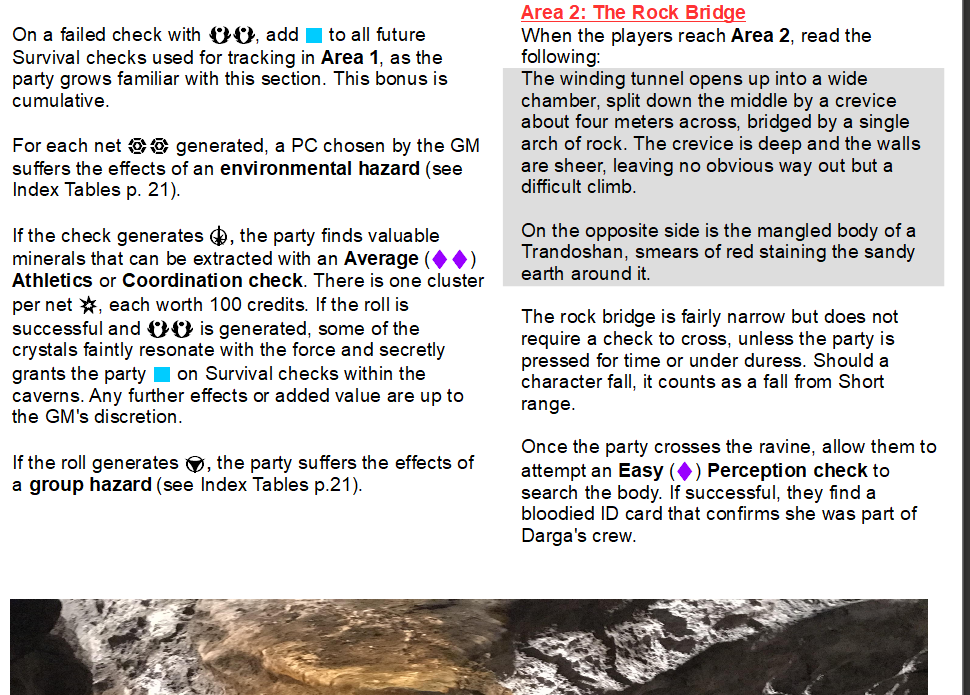
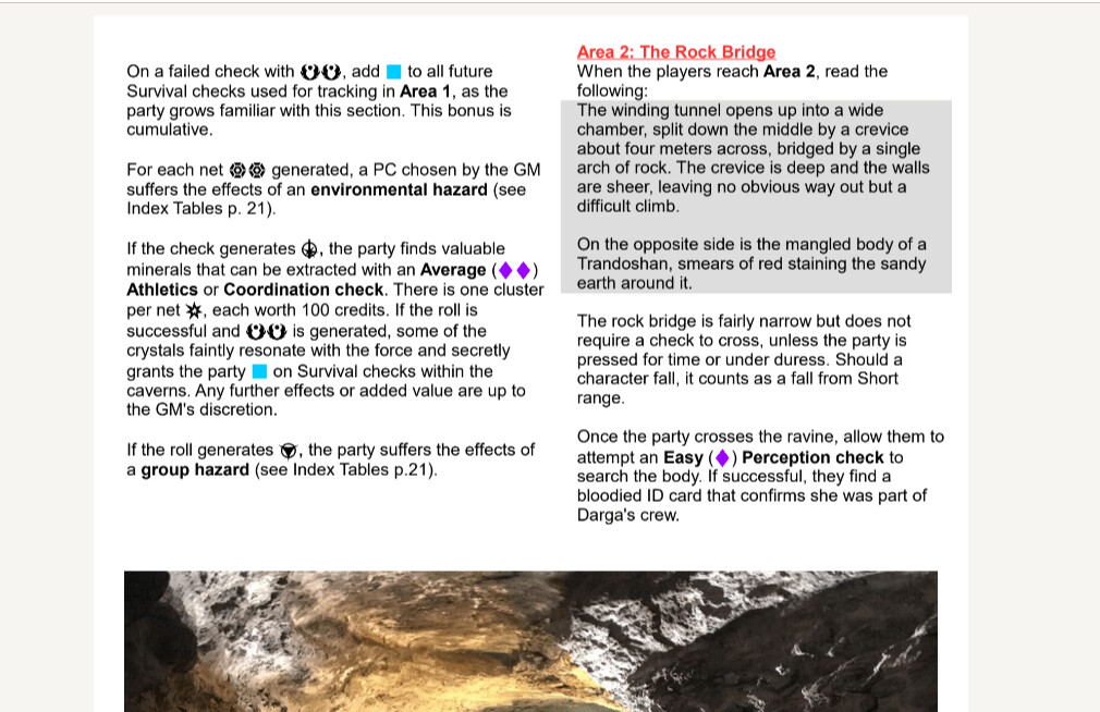
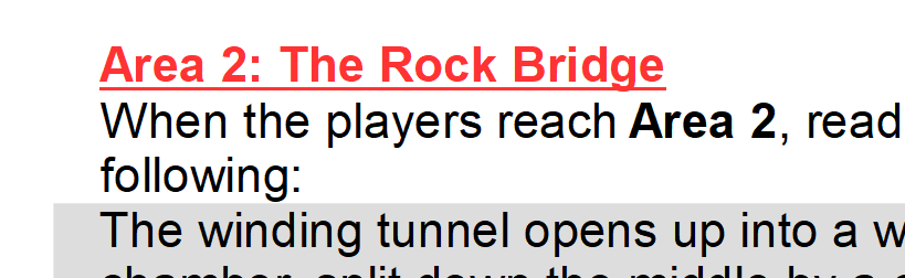
“Read the following”
The tail of the “g” sometimes touches the textbox. Looking at it in the picture you show, it’s fine. On the doc I have, it crossed over by about one pixel when zoomed all the way in. That overlap looks much bigger on a less-focused view.
It would be best if it had a little bit more breathing room. I don’t know how easy or hard it is to change, so I’m not specifically requesting that you do so. I am a perfectionist with a tendency towards certain OCD behaviors, so it drives me up a wall when things aren’t consistent or “just so.”
The generic pronoun should always be the same. Best to pick a style and stick to it. Otherwise you introduce potential for confusion when you switch between singular and plural.
Good for you! Best of luck! (luck=preparation+opportunity)
We’re so close I can taste it! If P-47s had taste buds. Your human idioms are sometimes rather beyond my comprehension, but they get the point across.
It looks good. In an ideal world, it would be stretched, but that gets complicated. Only thing I’d actually suggest is an ellipsis at the end of the crawl.
Added.
I meant that the colon and the rest of the header were not of the same style. The text was red and the colon was black. This error is still there, page 11.
Understood. I was looking at a different one.
The first was a change suggested for your consideration, the second was simply pointing out something of interest.
That’s what I thought… just making sure.
“Read the following”
The tail of the “g” sometimes touches the textbox. Looking at it in the picture you show, it’s fine. On the doc I have, it crossed over by about one pixel when zoomed all the way in. That overlap looks much bigger on a less-focused view.
Well, do I have news for you! By using the mouse or the arrow keys, I could move an object (i.e. textbox) by what turns out to be 4 “points”, which is often too much or too little… in my venture to align the columns I found a way to move it 1 point at a time. It’s not exactly an intuitive process but I will try to adjust all textboxes to be in a more… ideal spot. This has been bugging us both since the beginning so it’ll be good to finally have it fixed ;) Let me know if any of them are still irksome, and let me know if you’d like me to move it up or down 1 pixel / point.
The generic pronoun should always be the same. Best to pick a style and stick to it. Otherwise you introduce potential for confusion when you switch between singular and plural.
Roger that. I’ll read through it quickly and modify them to “he”.
Good for you! Best of luck! (luck=preparation+opportunity)
Thanks!! That is true. Most of the time it’s not necessarily the most qualified who get the job but the candidate who is best prepared and made the best impression.
We’re so close I can taste it!
Feels good! This turned out to be a massive undertaking!! We’ve been at it for months =p. Hopefully it will end up being used by the community!
The family does not have the resources or contacts to get off-planet without assistance. Even if the players decide to free them without their master’s consent, they will need a place to lay low until the party completes their main objective.
Just reading through p.11… with this “they”, I am referring to the family. Is this correctly written because of “them”, or does it clash with “players” ?
The generic pronoun should always be the same. Best to pick a style and stick to it. Otherwise you introduce potential for confusion when you switch between singular and plural.
Going back to pronoun usage… on p.17, most of the paragraphs explaining the search check refers to the PLAYERS but in the one for threats I revert to a singular player since the intent is for only one of them to get afflicted. As written it feels a bit off since a player himself would not get afflicted… so I am changing it to “a member of the party”. Let me know if you think that flows better.
Same idea on p.18 paragraph one. I changed “player” to “character”.
I only found, I think, 2 places where the pronoun actually needed to be adjusted. I chose to use it on p.21 a few times, when the word “character” was used up to 3 times in the same paragraph… makes it less repetitious.
“the players” “free them, their master, they will” “the party”
It is quite clear that the “they” refers to a separate group.
I’ll check these, the textboxes, and the page 17 thing.
Yikes. Time flies!!
- Headers
- Standard style: Blue, caps lock, and a different font, bolded.
- Current style: Red, underlined, inconsistent capitalization.
I’ll try to loosely base the headers & subheaders off the colors and style in this adventure:
A light blue for the major headers, and an orange for the others. I think “Segoe UI Black” is close enough font wise. I’ll use the ugly yellow & “Segoe UI Semibold” for a few tertiary headers ;).
Currently, the headers and sub headers have different fonts and various styling.
Let me know what you think size-wise and if you think the new style is consistent.
I also noticed that instead of saying “please note:” they say “The GM should note” without any styling, so I’ll change those as well.
On page 9, I simply removed “please note” before “Alternatively”. I think the paragraph can stand on its own without it.
On page 13, changed “For the GM” to “the GM should note”
Sadly the modification of headers made it so I had to re-align many textboxes. Can you verify again they are not clipping? Or maybe we wait until we’re done moving things around =).
I changed the headers to p.21 as ugly yellow and with similar styling (except special mentions). Should the referenced symbols (advantage, threat) be the same color as header or stay black?
p.21 added “the” in “clues found about missing crew”
For the pictures I stretched them to touch both sides when possible. This was not possible on p. 1 & 7 as the pictures are smaller. I re-arranged p.7 to accomodate the pictures side by side to be more like the style on the other pages.
That’s it for now!
Let’s do the pixel fixes last.
Everything else sounds good.
Does that mean you’re taking a break, or it’s ready for me to go back over?
Does that mean you’re taking a break, or it’s ready for me to go back over?
Hmm… I meant that I finished every change I could think of for headers and images, and that it was ready for review… but since then I made more changes ;). I’ll try to be clearer about that going forward.
I didn’t blur the images or anything like that but I think the few changes I applied make it look better.
I unbolded the dice symbols… I find it makes the Triumph look a bit scrawny but otherwise it looks fine and I do think they are unbolded in the adventures… they just have a clearer font.
Checks
- Description presentation
- Standard style: [Difficulty] ([Dice]) [Skill] check
From what I can tell, the correct format has bolded parentheses (here are a few screenshots)
Bolded examples:
![]()
![]()
Regular text
I will bold the parentheses surrounding dice pools.
P.9 - Moved dice pool to after “opposed” on a few rolls we had missed.
So the headers, images, bolding of parentheses around dice pools and unbolding of symbols are done and ready for review. I’ll wait for your confirmation before doing anything else :).
Thanks!
My parentheses were bolded, it just wasn’t totally clear.
Great! It was about half and half in the document so I went over them.
Alright, not much to go over here, so I don’t even need those spoiler tags.
This ought to be the final iteration, so I’ll PM you an invitation to the Discord server.
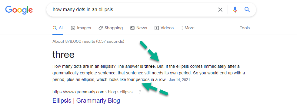
Page 4: The ellipsis should be spaced out a little, for a more Star-Warsy style . . . .
(also, four dots)
Ah… ok. Didn’t realize there needed to be a fourth for the original period. I added two spaces per dot.
Opposed Negotiation check has missed bolding on the parentheses.
Got it.
P.6 I noticed that for whatever reason, the right column on this page had some paragraphs at 12.5 size and at least one line at 14 instead of the usual 12 so I changed it to 12.
Page 6: “Charm, Negotiation comma, and Streetwise” (Oxford comma)
Got it.
Page 8/9: Could you keep the Blue Guava on the bottom left of page 8, and move the other picture to the top or bottom right of page 9? Since they’re column-sized, it ought to be very flexible.
I’ll move things around to make it happen. It makes the spacing a bit awkward on p. 9. Thoughts? I don’t think there’s enough room to bring the tactics section up.
Page 10: Since Despair cannot be canceled, “net” is irrelevant and should be dropped, either outright or in favor of another word.
It reads well to me by just dropping it.
Page 16: Textbox
Hmm… it did look OK to me but I dropped it by one point, now it seems, to me, a bit too close to the body of text. What do you think? Same for p.17 textbox.
- Page 18: “Core Rulebook” should be capitalized, but not bolded.
Just want to confirm that Age of Rebellion is OK to be bolded?
- Are you going to underline the area titles (i.e., “Area 4: The Lair”) or not? Because you did for Area 3 on page 17, but then not for Area 1’s name, which was written in the Area 1 description and in a different style (parentheses instead of colon). So anyway, those three mentions need to be unified.
Let’s not underline… and I’ll just shorten those references to Area 1 (bolded) or Area 2 instead of Area 1: Cavern Entrance.
Page 20: Consider moving Darga onto the opposite column, rather than having half the page blank.
There is so little text outside of his stat block that it looks even more awkward if I put him in the next column…
The bullets for the group hazards are farther from the text than the bullets for the individual hazards.
Fixed.
EDIT: All changes from post #115 have been changed or questioned above.
There does not. It’s a Star Wars-specific stylistic thing. Ordinarily, ellipses are just the three dots. I don’t know why Star Wars does it differently aside from perhaps taking up more space on the often sparse final line.
There does not. It’s a Star Wars-specific stylistic thing. Ordinarily, ellipses are just the three dots. I don’t know why Star Wars does it differently aside from perhaps taking up more space on the often sparse final line.
According to google it is actually 4 ;)
All changes from post #115 have been changed or questioned above and are ready for your review.